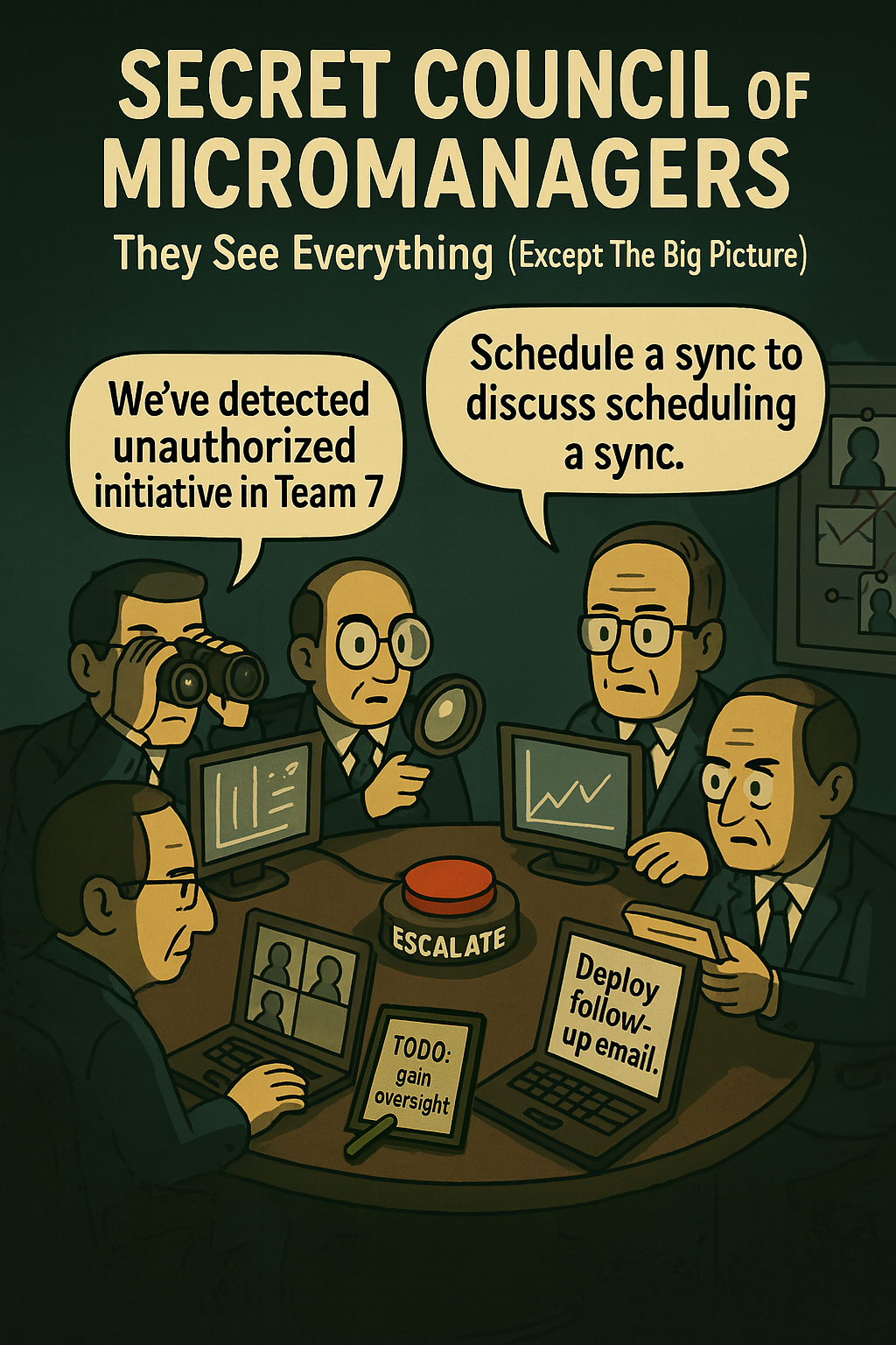
Dashboards promise transparency and control — yet in many organizations they have become sources of noise rather than insight. As metrics multiply, clarity erodes: teams track what is easy to measure instead of what actually drives value. This article argues that the real problem is not a lack of data, but an excess of poorly contextualized metrics that distort behavior, slow decisions, and create a false sense of understanding.
By examining the illusion of insight created by dashboards, the piece shows why more KPIs often lead to less impact. It reframes metrics as tools for decision-making rather than reporting artifacts, and makes the case for radical reduction: fewer, strategically anchored, and clearly owned indicators that are directly actionable. Ultimately, the article advocates for a shift toward a Minimum Viable Dashboard — one that tells a coherent story, supports real decisions, and restores focus in a data-saturated world.
In a world obsessed with dashboards, clarity has become a scarce resource.
Dashboards are everywhere — glowing with charts, KPIs, and live data. But in the race to measure everything, we’ve forgotten to ask what actually matters. The result? Teams overwhelmed by irrelevant metrics, chasing numbers instead of outcomes.
The Illusion of Insight
A beautiful dashboard feels like control. But data ≠ understanding. Most dashboards reflect activity, not impact. They reward the visible, not the valuable. Clicks, opens, sessions — without context, these are vanity metrics. And worse: they can drive the wrong behavior.
When More Becomes Less
- Noise over signal: Too many metrics obscure what really matters.
- Misaligned incentives: Teams optimize for what’s easy to measure, not what drives value.
- False confidence: Data is taken as truth, even when it’s flawed or out of context.
- Analysis paralysis: More dashboards = more debates = fewer decisions.
What We Should Be Asking
- ✓ What decision does this metric inform?
- ✓ Who owns this number — and what can they act on?
- ✓ Does this reflect user value or just internal performance?
- ✓ What would happen if we stopped tracking this?
“Data serves intent — not the other way around.”
The Case for Less
Radical clarity comes from constraint. Fewer metrics, chosen intentionally, sharpen focus. A small, trusted set of indicators — tied to real outcomes — beats a sprawling dashboard every time. Metrics should tell a story, not flood a screen.
How to Rethink Your Metrics
- Kill your dashboard once a quarter: Remove what’s unused or unowned.
- Anchor metrics to strategy: Every number should reflect a goal, not just a department.
- Involve humans: Ask teams what they really use — and what they ignore.
- Be ruthless about actionability: If no one can act on it, drop it.
Conclusion
Metrics should empower, not distract. Dashboards should guide, not dazzle. It’s time to shift from measuring everything to measuring what matters — clearly, simply, and with purpose. Because in a world overloaded with data, less is not just more. Less is essential.
In the end, it’s not about tracking everything — it’s about distilling what truly matters. The goal? A Minimum Viable Dashboard that informs, not overwhelms.
Less is not just more. Less is essential.
- Few, S. Perceptual Edge: Library of Visual Analytics Articles. Perceptual Edge. URL: https://www.perceptualedge.com/library.php
- Hubbard, D. W. (2014). How to Measure Anything: Finding the Value of Intangibles in Business (3rd ed.). John Wiley & Sons. URL: https://www.amazon.com/dp/1118539273
- YEC (Young Entrepreneur Council) (2016). Why Vanity Metrics Are Killing Your Business. Forbes. URL: https://www.forbes.com/sites/theyec/2016/02/08/why-vanity-metrics-are-killing-your-business/
- McKinsey & Company (2022). The Data-Driven Enterprise of 2025. URL: https://www.mckinsey.com/capabilities/mckinsey-digital/our-insights/the-data-driven-enterprise-of-2025


